InboxReads gets a lot of newsletter submissions but not every submission is equal. A successful submission that attracts subscribers requires presenting your newsletter in a concise but marketable way. Often newsletter writers make simple avoidable mistakes that don't do their work justice. Here I'm going to share some tips to improve your submission but also better market your newsletter in general.
Clear, then clever
When describing your newsletter the first goal is to clearly state what potential readers will receive if they subscribe. Everything else is secondary.
Often in an attempt to be fun and clever, creators fail to state what their newsletter covers. As someone who spends time verifying every submission, if I'm confused, potential readers who are just glancing will be confused too.
Once it's clear what you offer then you can inject your personality to make it fit your brand. If you need some copywriting tips check out these articles.
Branded Images
There are 4 approaches to newsletter images that I see.
- No Image - which becomes a screenshot of your landing page
- Generic Image - a photo with no branding
- Logo - an image of your logo on a plain background
- Branded Image - a unique image with your logo and/or tagline
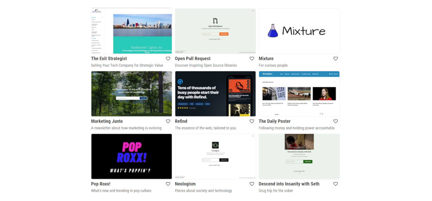
Based on my observations the ranking of each by performance would be 4 -> 3 -> 2.
A screenshot of your landing page (1) is dependent on your page. If you're just using Substack you're going to blend in with all the other Substack newsletters. But if you have a decent landing page it can look almost as good as a branded image.
Of course, creating a branded image takes time and you might not be used to designing. But there are great free tools like Canva that make it super easy. If you don't have a logo just put your newsletter's name in a nice font on an image that fits your brand. If you do have a logo, anything but a plain white background gives you a leg up.
Broad Topics
InboxReads submission form has a field to list the topics your newsletter covers. Most submissions handle this well but some struggle with deciding which topics to use. The key here is to be specific but broad.
If your newsletter covers "video game walkthroughs" your categories should be "gaming" and "video games".
Why not be more specific? Because you want your newsletter to appear in popular categories so readers can find it. Readers interested in gaming newsletters are likely to be interested in yours. There are way more people searching for "gaming newsletters" than there are searching specifically for "video game walkthrough newsletters".
That's All
Perfecting how you describe and share your newsletter can be tough and is an ongoing process. You're going to have to try a lot of things before you find what works. But with these tips in mind, you can make that process a bit easier and get the most out of your submission.


