In an age of ever-shrinking attention spans, designing for skimmability is a virtue.
However, the newsletter, unlike traditional marketing emails, is for a different breed of audience. The newsletter audience is typically made of readers, not skimmers.
The typical reader wants to engage, hates disruption, and doesn’t mind scrolling.
As a result, newsletter design demands a different approach. Restraint becomes key. At no point must the design disrupt the subscriber’s reading experience.
This is not to say that newsletter readers never skim at all. They do. You optimize for both.
As the newsletter industry grows, it is important to recognize common and less obvious design mistakes businesses often make. Let’s review these key issues.
7 newsletter design mistakes
-
Poor use of negative space {#poor-use-of-negative-space}
White or negative space is a critical design element in email. It allows the viewer to focus on the most important portions or segments of an email.
Like we said, the newsletter is targeted at the reader who hates disruption.
Negative space is what eliminates visual disruption from the viewing experience.
For example, consider the following newsletter from the University of Cincinnati.
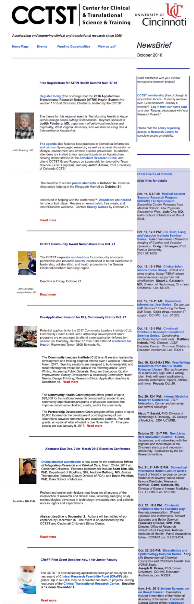
Source: NN Group
The newsletter has no negative space at all. It lacks many other things as well, such as visual hierarchy, clear CTA buttons, well-positioned thumbnails, etc.
Compare Cincinnati’s newsletter to this one from Sublimio. The difference is evident.

Source: RGE
Below are several effective ways to use negative space in your newsletter:
-
Position key text or visuals away from competing elements to guide the viewer’s attention.
-
Focus on visual balance rather than perfect symmetry. Adjust spacing and alignment to create a cohesive composition.
-
Treat text as a visual element. Evaluate the shapes created by lines and columns, and refine any uneven or distracting text blocks.
-
Refine text spacing throughout the layout. Adjust line breaks, line height, text width, and paragraph spacing to improve readability and create visual breathing room.
-
Use quiet areas to establish atmosphere. An image can function as whitespace if part of it contains minimal visual information and does not compete for attention.
Use the squint test by blurring your vision or squinting at your design. If distinct sections merge or appear unclear, increase the separation between elements.
-
Confusing legibility with readability
Legibility and readability are distinct concepts.
Legibility refers to how easily individual characters can be distinguished, while readability relates to how easily larger sections of text can be read and understood.
As a result, a newsletter may be legible without being readable, and vice-versa.
For example, HUR Five’s newsletter scores low on both readability and legibility. Check out their email. Low contrast, justified alignment, and serif fonts reduce accessibility.
In addition, the footer is practically invisible.

Source: HUR Five
When we discuss things like typeface, font size, spacing, or font weight, the focus is on legibility, not readability. However, both should be addressed separately.
In the context of design, our primary concern is legibility.
Consider these tips to improve your newsletter’s legibility:
-
Choose typefaces that have clear and distinct characters and make sure that similar letters, for example I, l, O, and G, can be easily distinguished.
-
It is advisable to avoid decorative fonts when clarity is a priority since script and highly ornate display fonts make it harder to recognize the characters.
-
It is not appropriate to use all capital letters with script fonts since this makes the individual letters more difficult to identify.
-
Choose a suitable font weight; the text shouldn't be so thin that it becomes faded or so bold that the details are lost.
-
Do not stretch or compress the fonts and keep the original proportions of the typeface.
-
It is important to have contrast; you can use online tools such as WebAIM's Contrast Checker to check your colour combinations.
-
To evaluate legibility in the final context, the text should be reviewed taking into account its actual background, colour, size, and the conditions under which it will be viewed.
Always make sure to test the font at its final size. A typeface that looks clear in a large preview may become difficult to recognize when reduced.
-
Designing image-only newsletters
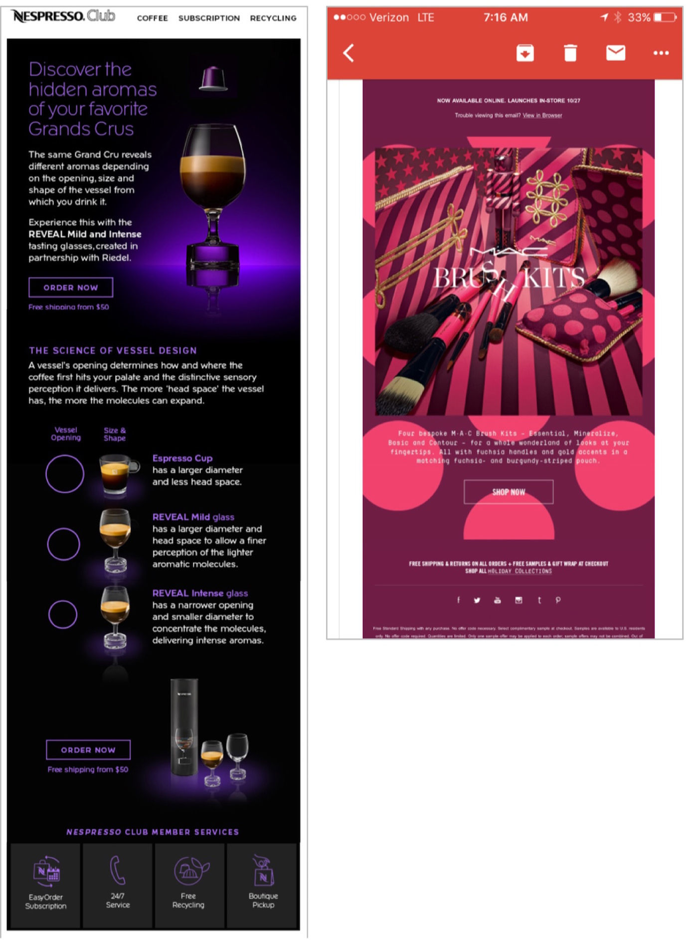
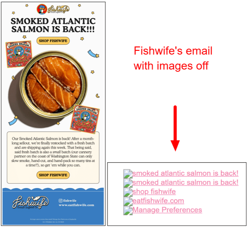
Image-only emails or newsletters are against accessibility. Many email clients block images by default. Subscribers may choose to block images, too.
In fact, image-only emails with no alt text or bad alt text can also impact deliverability.
Subscribers who use screen readers cannot access image-only emails. Only the View Online link and the footer, including the unsubscribe link, are accessible to screen readers.
The lesson: Image-only newsletters or emails serve no one. Check out Fishwife’s email. With the images disabled, it is just a pile of alt-text.
But that doesn’t mean you can’t use images. Save these expert tips for when you use images in your newsletter:
-
Aim for approximately 60% text and 40% images in your content. (No images is also fine)
-
Compress images to keep file sizes under 200 KB (ideally below 100 KB). Large images can slow loading times and may cause Gmail to clip your email.
-
Include clear Alt Text to ensure subscribers understand the content if images don’t load.
-
Never place CTA buttons, dates, promo codes, etc., within images. Use bulletproof HTML buttons and live text to ensure accessibility when images are disabled.
Make sure designs are optimized for dark mode. For logos or icons with dark text on transparent backgrounds, add a subtle light stroke or background fill to maintain legibility.
-
Ignoring readers on mobile devices
According to Fable’s survey for the state of reading in 2026, 57% of survey respondents consume both audiobooks and ebooks, with smartphones being the most common device.
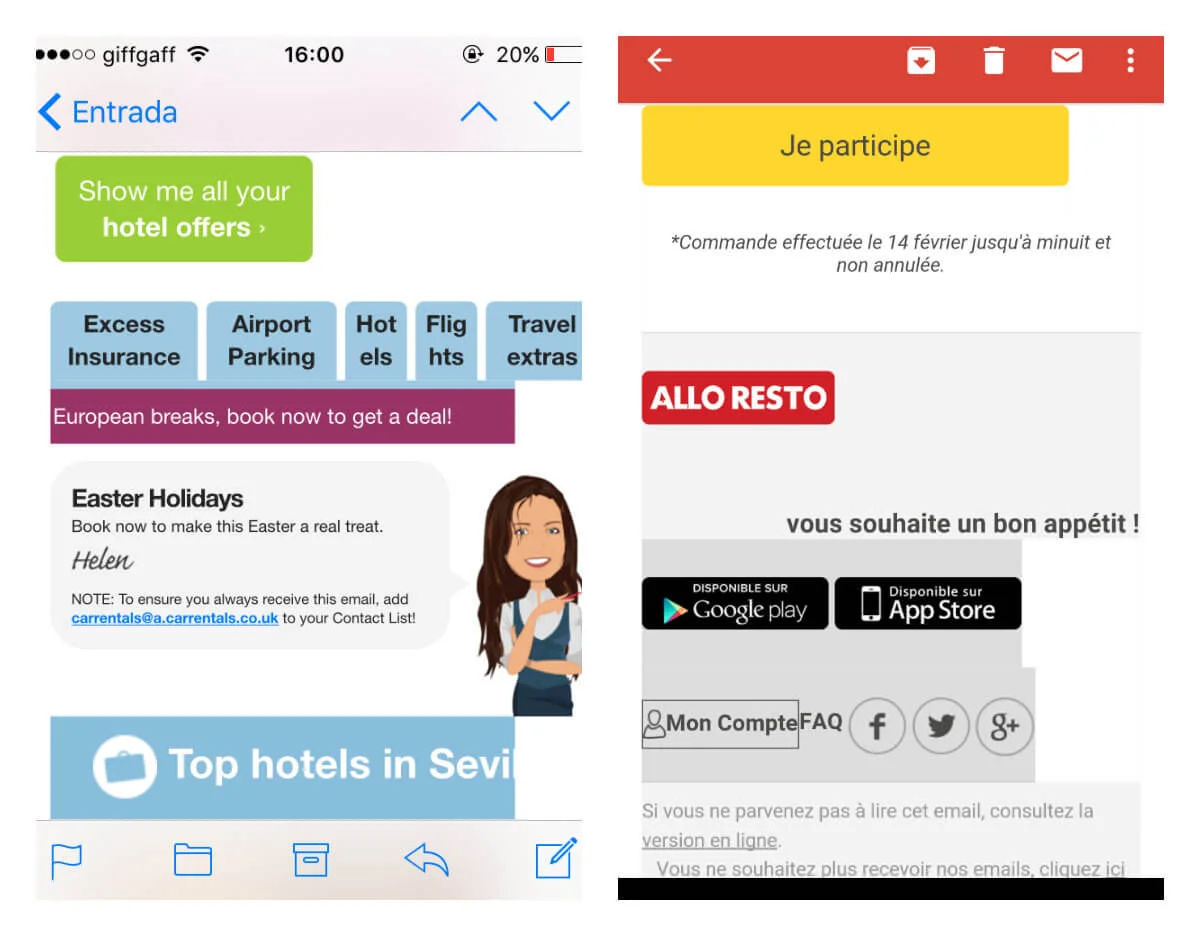
Your readers are increasingly mobile and on mobile. So your newsletter has to be responsive. A responsive email is designed and coded to automatically adapt its visual layout, image sizes, font scaling, and structural elements to fit the screen size and orientation of any device.
Here’s an example of an unresponsive email.
Now, here’s how a responsive email looks like.
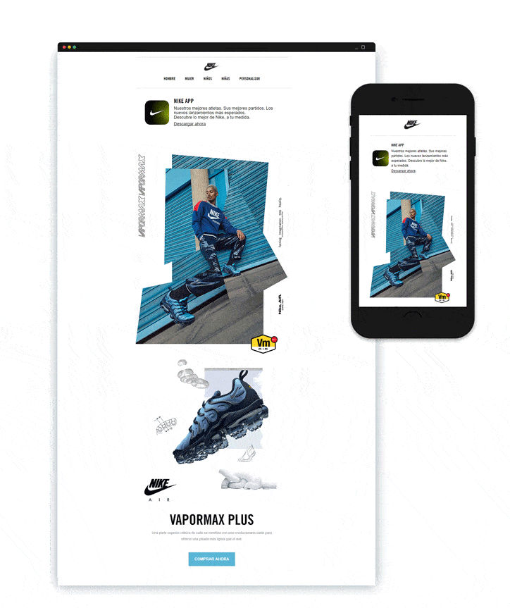
Evidently, an unresponsive newsletter is a deal-breaker.
Responsiveness belongs in the coding department. As far as design goes, consider these proven strategies to help your newsletter deliver a seamless reading experience:
-
Use a single-column layout. Multi-column designs often display poorly on mobile devices, while a single vertical layout maintains a clear content hierarchy.
-
Design for touch navigation. Use touch targets of at least 44×44 pixels. Make sure there is sufficient vertical spacing around links and buttons to prevent misclicks.
-
Limit header image height to 150–200 pixels to ensure the main headline and opening text are immediately visible.
-
Optimize for fast loading. Mobile readers are often on cellular data or spotty WiFi.
You can also use the cloze test. It’s a method in which words are systematically removed from a passage and readers must fill in the blanks using context, grammar, and vocabulary. On mobile, limited visible text makes it harder for the reader to retain the context throughout. You can try the cloze method with a test audience to assess their ability to fill the missing words.
-
Creating an inconsistent reading pattern
Newsletter design should not force readers to relearn the interface with every edition.
Subscribers develop a mental map of recurring newsletters, learning where to find their preferred sections and information. Consistent formatting helps them navigate content efficiently.
Frequent layout changes may appear creative but can disrupt established reading habits.
To create a predictable reading experience:
-
Make sure that the sections which recur do so in the same positions.
-
Apply the same structure to different types of content.
-
Put the headlines, summaries, bylines, images, and links in a consistent order.
-
Keep the same visual hints in every edition.
-
Carefully consider making design changes and do not overhaul the entire experience unless there is a clear reason for doing so.
Consistency does not mean every issue must look identical. It means readers should not have to spend time figuring out how to use the newsletter.
-
Making the newsletter look like a website
A newsletter should align with your website’s design, not replicate it.
Including full website navigation in an email uses valuable space and can bury key content. On mobile devices, navigation items may display poorly and are harder to scan. Instead:
-
Use familiar brand colors, typography, and visual cues.
-
Keep the newsletter focused on its primary content.
-
Include a clear link to the website rather than reproducing the entire navigation system.
-
Ensure newsletter links lead directly to the relevant content, not merely to the homepage.
-
Maintain visual continuity between the newsletter and the landing page.
You want the newsletter and website to provide a cohesive experience.
-
Not visually distinguishing between ads and content
When promotional content closely resembles editorial material, readers may feel misled, which can erode their trust in the sender, not just their opinion of the ad.
Have a few simple safeguards in place:
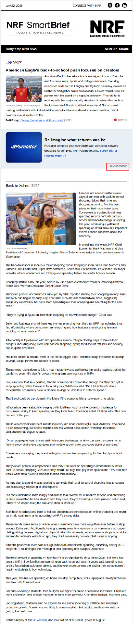
- Clearly distinguish promotional content by using a different background color, a border, or a clear "Sponsored" or "Ad" label.
Here’s how NRF does it in their newsletter.
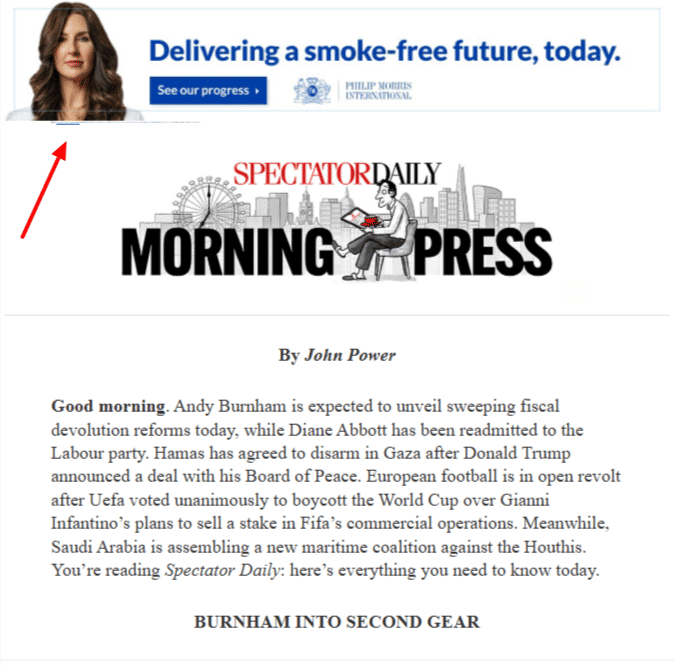
- Avoid placing advertisements at the very beginning of a newsletter. When readers encounter an ad before any substantive content, they may perceive the entire email as a sales pitch and disengage. Spectator’s Morning Press newsletter could use this tip.
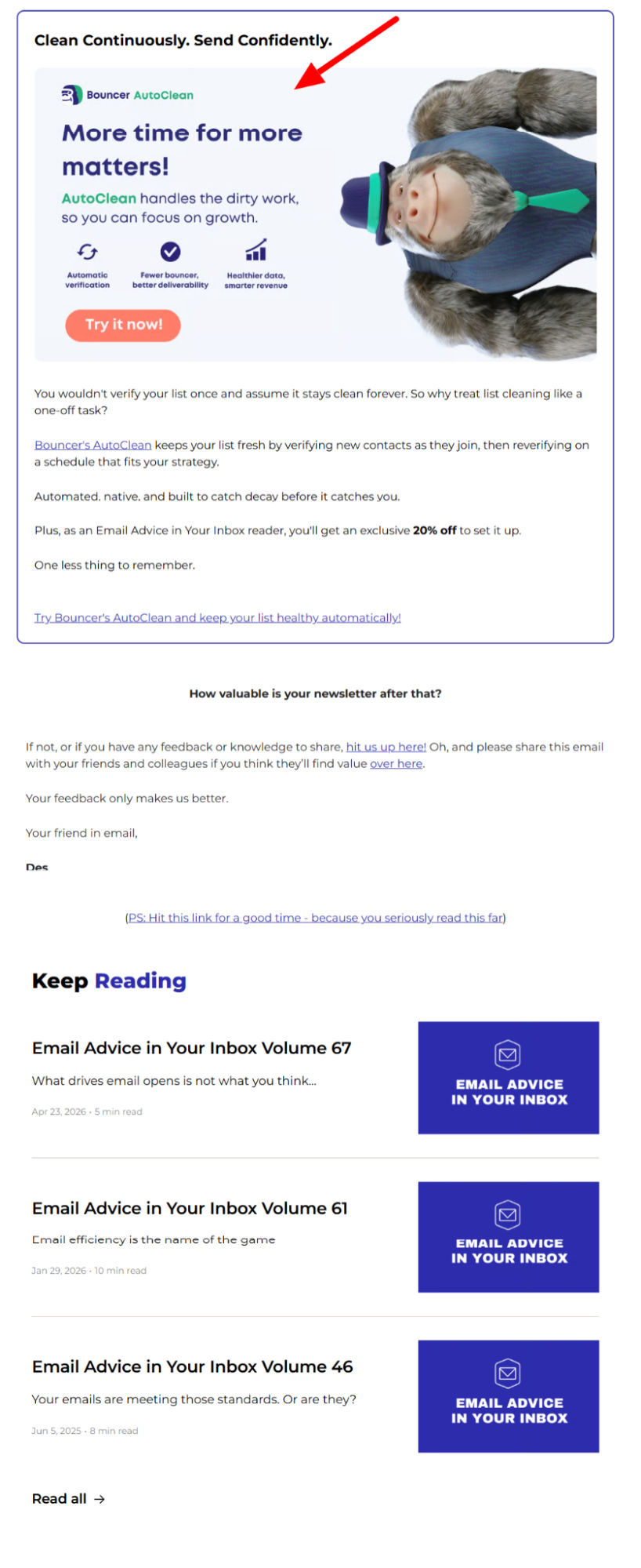
- When including advertisements, prioritize placements that are relevant to the surrounding content. Ads unrelated to the main topic are perceived as more intrusive, even if they appear at the same frequency. Des Brown’s newsletter, a newsletter about emails, does this quite well.
Email accessibility: How to make a newsletter accessible?
Email accessibility involves designing and formatting emails so that all users, including those with visual, auditory, cognitive, or motor disabilities, can read, navigate, and interact with your content without barriers.
This includes individuals who use screen readers, assistive devices such as switch controllers, or those with color vision deficiencies, low vision, or dyslexia.
Please note that accessibility is also a legal requirement.
However, accessibility should not be viewed solely as a technical issue. Avoiding common design mistakes and using clear writing both play a significant role in making newsletters accessible.
As Raul Aguayo-Krauthausen, a German disability rights activist and writer of Disability News Digest, points out that while platforms like Substack are building better accessibility tools, content design remains key: “I want to get any text read out the way I need it. It doesn’t depend on the app, it depends on the content.”
Accessibility is a broad subject. Begin by considering the following key points:
-
Use proper semantic HTML by structuring content with appropriate heading tags, such as <h1> and <h2>, and declaring <html lang="en">. This ensures screen readers can navigate content effectively and pronounce words correctly.
-
Write descriptive link text by replacing vague phrases such as "click here" or bare URLs with meaningful action links, for example, "Read the 2026 Diversity Report." This provides clear context for users of assistive technologies.
-
Maintain strong color contrast and readability by ensuring a minimum text-to-background contrast ratio of 4.5:1. Left-align body text and use clean, legible fonts at 14px or larger.
-
Provide informative alt text for images by describing essential visual content with concise alt attributes. Mark decorative images with alt="" and avoid sending emails that contain only images.
-
Design accessible CTAs by creating robust HTML and CSS buttons with touch targets of at least 44 by 44 pixels.
Email newsletter testing & cross-client rendering
A newsletter that appears flawless in your test inbox may display incorrectly in other email clients. Variations in how clients handle spacing, fonts, and images can cause layouts to break, text to be cut off, or images to disappear, depending on the client used. This is important because readers typically hold the sender responsible for these issues, not their email client. Formatting problems can reduce your credibility and decrease the likelihood that readers will open future editions.
Here’s a testing checklist worth building into your send process:
-
Test your newsletter in all major email clients before each send. At a minimum, include Gmail, Outlook, Apple Mail, and one Android mail app on both desktop and mobile. Rendering can change after any template edit, so make this a standard part of your pre-send process.
-
Distinguish between responsive templates and those that only scale down. Responsive designs adapt layouts for each device, such as converting two columns to one on mobile, preserving readable fonts, and maintaining large tap targets. Fixed-width designs that only shrink can result in text and buttons that are too small to use comfortably.
-
Review tap-target size and spacing in addition to readability. Clickable areas should be approximately 1cm by 1cm with adequate spacing. Crowded links and buttons can cause mis-taps, which users may attribute to your newsletter.
-
Treat file size as a measurable constraint. Newsletters with large image files may load slowly, even on strong Wi-Fi, while those under 100KB open quickly. Load time directly impacts your brand’s perceived trustworthiness. Always check total payload size before sending.
-
Ensure the newsletter remains clear when images are disabled. Test to confirm your brand name and core message appear as text or alt text, not solely within graphics.
-
Consider print rendering if your audience may print and read offline. Email clients often add borders or margins, so layouts designed to fit a printed page exactly may be clipped. For long-form or reference content, conduct a print test as well as a screen test.
-
Re-test after every significant template change, even those that seem cosmetic. A single CSS adjustment or new content block can affect rendering in one client but not others.
Wrapping up!
A newsletter does not have to impress readers with a new design each week. It should give them a reason to come back.
Once the layout is known, the content is easier to navigate. If the design does not interfere, then the writing has the space it needs to carry out its function.